Why I Keep My Eyes on Multiple Time Frames
Just about everything that has to do with trading is a variable unless or until defined specifically. The terms “trend” and “reversal” and “reversion to mean” are no different than any others.
Momentum & Change
A body in motion tends to stay in motion. That’s the underlying fundamental premise of trend following. Price going one direction tends to continue that direction until greater force comes in to change direction again. Now the definition of “trend” is subjective and dependent. Upon what time frame are we referring to as the trend? Obviously that answer will differ when looking at a 5-minute chart, a 60-minute chart and a daily chart of the same symbol.
There are basically two kinds of price turn = trend change patterns overall. One is a sharp v-turn, and one is a deliberate 1-2-3 transition. The sharp v-turn is usually expressed as a gap & go move or an abrupt rally or plunge from what seems to be a trend direction sustained. The deliberate or methodical 1-2-3 turn is a classic high low – lower high – lower low progression. In other words, we watch price action roll over or upwards and continue on. That’s about it for choices of directional trend change: deliberate or abrupt.
Here’s the point where most aspiring traders get themselves in trouble: it’s tough to setup one lone chart with any kind of price measuring tools (indicators) that can identify both patterns equally well. The easy answer may seem to be ignoring chart tools while relying on price behavior alone. Anyone who strips their chart naked and tries to follow “pure price” with nothing else invariably run into sideways chopper periods that carve naked traders to shreds as they try to get on the correct side of price when no side exists.
If that weren’t an irrefutable fact, every price-only trader out there would be obscenely rich and every other trade would likewise strip their charts naked tomorrow. One of the biggest lies in trading heaped upon newer traders is the concept of using naked charts and nothing else for price direction forecast. Pure hogwash… coming from someone who uses both and knows the unspoken ins & outs of each approach.
Forest And Trees
So the answer to this problem of directional forecast or bias is neither indicator paralysis or indicator avoidance. Each has equal strength and weakness alike. One answer I have found is to setup a trend or filter chart that leans toward what patterns you wish to see that matter most for your style of trading. Think of that trend “bias” or “filter” chart as the overall view of a forest. You have a wide enough view to see all of the trees in a zone. At a glance you assess the collective trees in general size, condition and health, species of value for timber versus firewood or pulp, etc. All that information can be gathered from stepping back and looking at a collective forest of trees.
Setting up a smaller time-frame chart in harmony with the trend bias or filter is akin to walking inside that forest and examining each tree. A closer look shows every timber species like sugar maple, black cherry and walnut trees with straight trunks and solid girth. Around them you see off-species such as hornbeam, locust and hickory, only good for firewood or pulp. Inside the forest you are looking specifically for the valued timber trees while working around the off-species trees.
Exact-same concept when trading. We are looking at a longer-term filter chart to assess the overall condition of our “forest” aka the intended market to trade. That shows us current trend bias, where and when the last direction change happened, what stage of the existing direction we are in (early or later) and where next points of price attraction may exist. Then we shift our gaze over to a shorter-term chart for exact dissection of price bars and patterns that tell us where specific actions for trade entry, management and exit decisions are prudent.
All Relative
Anyone’s choice of filter chart = trade chart is a relative compromise. Whether it is a daily chart and hourly chart for swing trading stocks, options or commodities (including FX), whether it is a 60-minute and 5-minute chart for intraday swing trades or even a 5-minute and 500 tick chart for short-term profit trades is irrelevant. The concept remains identical in all examples given. Selecting one time-frame chart to assess a wider scope of view for establishing “trend” direction and then working inside a smaller time-frame to surgically breakdown price behavior in harmony with the trend bias direction is what counts. Exactly which setting charts is 100% wholly dependent on each trader, the chosen market or symbol they select and what their desired trade approach is, i.e. size of intended profit versus risk in dollar value terms.
In my case, I want to work strategic pullbacks or breakouts in harmony with trend bias until the true underlying direction has truly changed. I would much rather miss an early, abrupt price turn than get faked out of the strong directional trend on a deep pullback blip. I personally want to enter inside those deep pullbacks that soon resume directional trend. So my solution to the compromise which suits my personal trading best is a slow, soft trend-following filter chart setup.
Someone who more values price turn and reversal patterns would instead setup their filter chart view with more sensitive parameters. They are willing to get faked out on the false turns which are merely deep pullbacks in exchange for hitting the true turns earlier. This is merely systematic trading 101. No one can see everything in the market all of the time. We can set that delusional fallacy aside. Anyone can adjust their charts to see prevailing trend or potential price turns with greater emphasis. But not both. Pick your preference and set filter sensitivity accordingly. Manage the other side of your choice with prudent stop-loss management.
Wave On Wave
I have always viewed the live market from two charts’ perspective. For better or worse, that has always made sense to me. If you agree to the fact that price action for any market or symbol is a stair-step process higher or lower in general, why not measure which way the escalator is going and look for steps in that direction? Then it’s just a matter of timing your footfall in harmony with the revolving belt heading up or down.
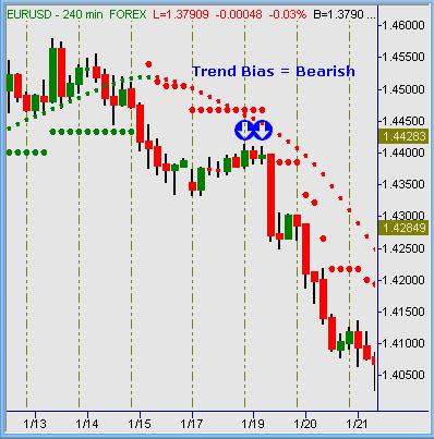
Pretty much the same concept in trading. Your trend – filter chart view of which way currently holds momentum. In the example above, EUR/USD rolled over in mid-January 2010 and dropped from roughly 4450 to the 4050 levels or -400 pips in pure trend fashion inside four trading sessions. That view was pretty clear in a longer-term chart such as 120-minute or 240-minute chart settings, two popular choices of FX traders.
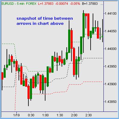
Within that trend-down move were a couple of pullbacks against the trend. Examples of the first one are visible in 5-minute charts that follow. Traders watching just that timeframe alone would not see the overall trend itself… they would see a tape that’s rising off lows, staging higher-lows and higher-highs, etc. Within the 5-minute chart alone, the view is short-term and obviously subject to sideways noise. Those who attempt the long-term failed folly of scalping FX for pips will find themselves churned to pieces in sideways noise on their way to going broke.
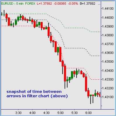
Traders who hunt for modest to moderate price swings for profitable trades cannot see enough information in the 5-minute chart alone here. But using a higher time-frame chart like the 240-minute as a filter to establish “trend” and trading in that direction alone (short side) is working with overall price momentum. Trading with momentum is swimming with the current: overall path of least resistance for most distance covered.
That chart selection needs to balance the compromise between “seeing” the overall trend through normal pullbacks before resumption and “seeing” true directional change. In other words, which is a true price turn headed the opposite way versus normal pullback and continuation?
Summation
One lone chart does not give clear scope to the overall market direction to anyone in any case with any exceptions. Traders who opt to use a single chart for trading likewise accept the fact that they must find ways to filter through inevitable noise of pullbacks against trend versus following trend. That in itself is a topic enough for small books, let alone brief discussions here. Suffice it to say that trading with a longer-term chart for the bigger picture relative to a shorter-term chart that shows inside view for precision is a great approach to staying on the correct side of pending price action more often than not. Bodies in motion tend to stay in motion… staying with that motion is the essence of small losses and large gains in this chosen profession of yours.
Austin Passamonte is a full-time professional trader who specializes in all commodity markets. Mr. Passamonte’s trading approach uses proprietary chart patterns found on an intraday basis. Austin trades privately in the Finger Lakes region of New York. Click here to visit CoiledMarkets